
Workforce Planning
Use "Sandbox Mode" to drag and drop nodes, simulating a reorganization or a new department launch without affecting live data.

Succession Planning
Identify "high-potential" employees within the chart and map out their path to leadership roles to ensure business continuity.

Cost Management
Overlay salary or budget data onto the chart to see which departments are over-staffed or exceeding budget.

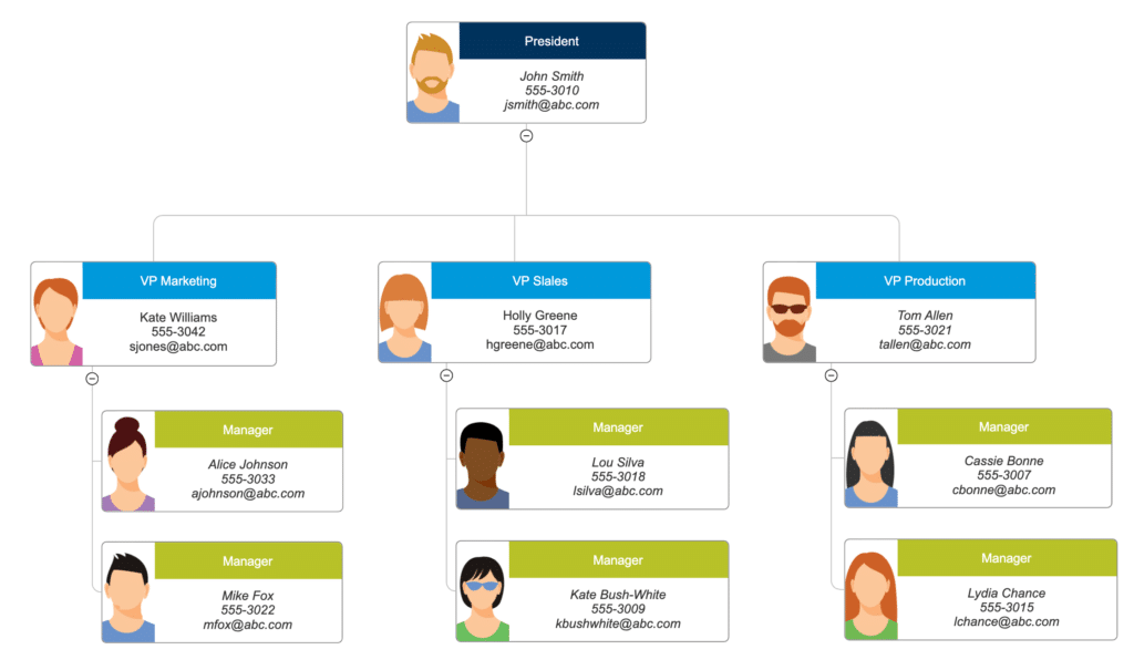
Operational Transparency
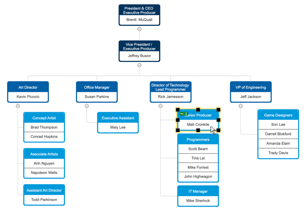
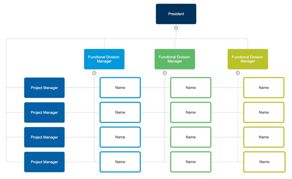
Instantly see the "Span of Control"—if a manager has 20 direct reports, the chart visually flags this as a potential bottleneck.

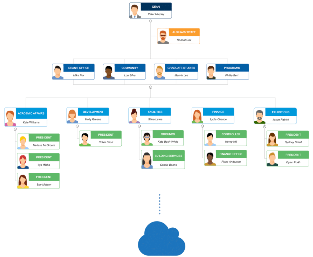
Onboarding Acceleration
New hires use the chart to understand the "lay of the land," identifying key stakeholders and where they fit in the company ecosystem.

Growth Forecasting:
Visualize how adding 10 new roles will look in your structure and budget.
Anatomy of an HCM Organization Chart
Intelligent Nodes (Employee Cards)
The fundamental building block. Each “node” is a digital identity card containing:
Visual Identity: High-resolution employee photos.
Professional Details: Full name, designation, and unique Employee ID.
Real-time Status: Live indicators showing if they are currently “In-Office,” “Remote,” or “On Leave.”
Primary Reporting Lines (Solid Lines)
These represent the formal chain of command. Solid lines clearly define the direct hierarchical relationship between a supervisor and their subordinates, ensuring accountability and clear communication channels.
Matrix Reporting (Dotted Lines)
In modern, agile workplaces, employees often report to multiple leaders. Our charts utilize Dotted Lines to represent cross-functional or project-based reporting, providing a 360-degree view of an employee’s responsibilities.
Departments & Divisions (Smart Clustering)
To simplify complex structures, HCMDrive uses Color-Coded Clusters. This allows you to visually separate the organization by function (Sales, IT, HR) or by Geography (Noida, New York, London) with a single glance.
Vacancy & Talent Gap Indicators
Identify where your team is under-resourced. We include Placeholder Nodes for open positions. This helps HR and Department Heads visualize “empty seats” within the hierarchy, turning the chart into a recruitment planning tool.
Metadata & Analytic Layers
Switch on “Data View” to overlay critical metrics directly onto the chart. View live data points such as:
Span of Control: The number of direct reports per manager.
Headcount Accumulation: Total staff count for an entire branch or department.
Budgeting Info: Salary bands or department costs (available for Admin views only).

